
Google Buzz is Already Dead
There is no way Google Buzz will be a successful product. Why not? Here's a hint: It's more than those massive security blunders, since Google is already fixing those.
It’s because the Buzz interface creates an entirely wrong UX (user experience).
Reading updates feels like an obligation
Look at me, look at me!
This is a huge mistake.
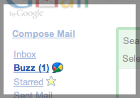
- Buzz appears right below Inbox in Gmail's left-hand navigation. And like "Inbox," "Buzz" becomes bolded and shows an unread count in parentheses when it contains unread items.
- New content on Buzz receives yellow highlighting.
- Any replies, no matter how insignificant the are compared to the hopefully serious items in my email inbox, get bumped into my Gmail inbox.
- When I got Buzz, my Google Reader account instantly started overflowing with every single article anyone I follow on Buzz shares, as if I didn't have enough to read already. RSS feeds are not as inconsequential as Twitter feeds. This should not be default behavior, and there should be a way to opt out of this without stopping following everyone on Buzz!
None of this makes any sense. Since Buzz is a direct competitor to Twitter, Buzz updates are theoretically low-value, non-critical, skimmable, and okay to completely ignore. Adding an unread count encourages users to catch up on Buzz items as soon as one or more new ones are available. All of the above "features" interrupt workflow, fragment skimming sessions, and ruin the low-intensity "skim, read, and briefly respond" experience.
After all, there's a reason Twitter isn't a service that emails you all of your friends' updates.
| Fun | vs. | Stressful |
|---|---|---|
| Stream | vs. | Inbox |
| River of news | vs. | Action items |
| vs. | ||
| Unread count | vs. | Recent items |
| Serendipity | vs. | Obligation |
Doesn't encourage scanning
Inline content (like pictures & video) and comments (as opposed to separate @-replies) are one of the biggest reasons that Pownce and FriendFeed never caught on.
Why? After all, they sound like a good feature; they make it easier to see shared content, right? Wrong. Inline content steales focus.
- Inline pictures and videos are all your eye will want to look at, instead of scanning faces, names, and text
- They take up room that could be used to fit more (text-only) updates on the screen. This makes quickly scanning updates much more difficult.
- The assumption I care about peoples' replies or "likes" to updates is often going to be incorrect.
Each item in the Buzz interface takes up way too much room. Look at this: Only one update fits on my screen at a time.
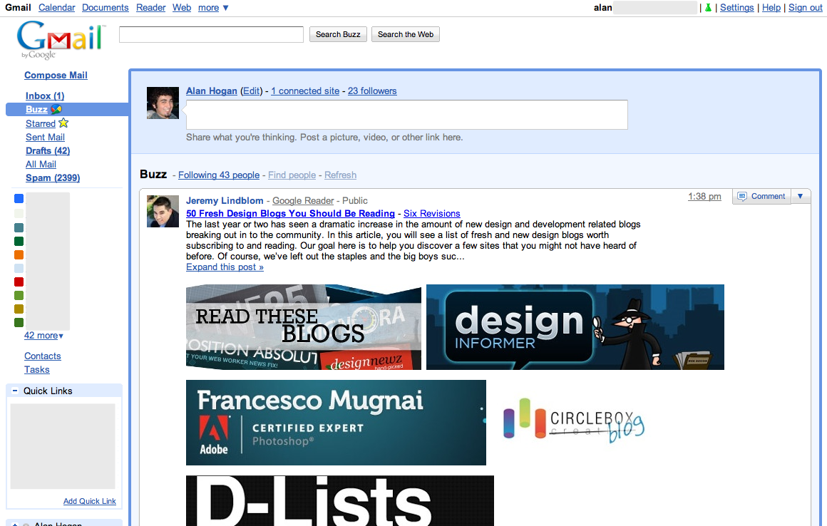
The text of each update is de-emphasized by the abundance of text-heavy, shiny, space-stealing options. Just look at this. The dubious value of the "Email" action does not in any way warrant its prominent position here. Two "Comment" links is two too many (okay, at least one), and a simple grey icon would be less distracting. "Like" is way too visually prominent. And just look at all the wasted space and text when I am the only one to "like" something:

What's up with the visual weight given to the source of each update (Twitter, Buzz, Reader, Picasa, etc.)?
I'm done design-raging now. Time to let my other personality defect shine, and be anti-social:
Too many non-friends
Consider this: I am following Doug Bowman (@stop) on Google Buzz. He's a pretty popular guy on Twitter, as a high-profile employee of theirs, and good designer, to boot. This means lots of people follow him not only on Twitter but also on Buzz.
- When I comment on his status, his own update shows up in his Gmail inbox so he can see my response. Now, I think I'm a pretty cool guy, but that doesn't mean Doug does, and I'm going to go out on a limb and say he doesn't care for every Tom, Dick, and Jane's comment cluttering his inbox.
- Similarly, when someone else comments on or "likes" his update, that update gets promoted to the top of my Buzz feed. That's ridiculous and confusing by itself, but when I don't know 90%+ of the people following Doug, there is precious little value to that. It also unfairly makes Doug's updates much more likely to be read than less-popular Buzzers', since his are more likely to be commented on and thus more likely to be at the top of my feed when I use Buzz.
This means the Buzz user experience can be filled with socially-irrelevant noise.
We've seen all of this before
A year ago, Dare Obasanjo listed these four criticisms with FriendFeed, a service which, like Buzz, allowed people to consume updates from Twitter and elsewhere:
- Too few items per screen
- Secondary information clogs up each item
- Difficult to scan content titles quickly
- People who aren't my friends
Sound familiar? Buzz has those same UX problems. Does no one at Google learn from others' mistakes? Does no one at Google read Dare?1 Sheesh.
-
How many times has Dare, also known as Carnage4Life, insightfully written about consuming feeds of content? There was Some Thoughts on User Interfaces for Activity Streams, then RSS readers modeled after email clients are fundamentally broken, and finally The Top 5 Reasons RSS Readers Went Wrong, for starters. Update: And just today, he writes about Google ignoring user privacy to give Buzz a competitive advantage. ↩︎